Python Plotly widget
As customization and flexibility of use are very important for Wizata, the Plotly library from Python is installed by default on the Wizata application for endless possibilities. The widget uses the power of Wizata to get the necessary data to construct a plot, and simply renders the plot automatically after the user inputs the code.
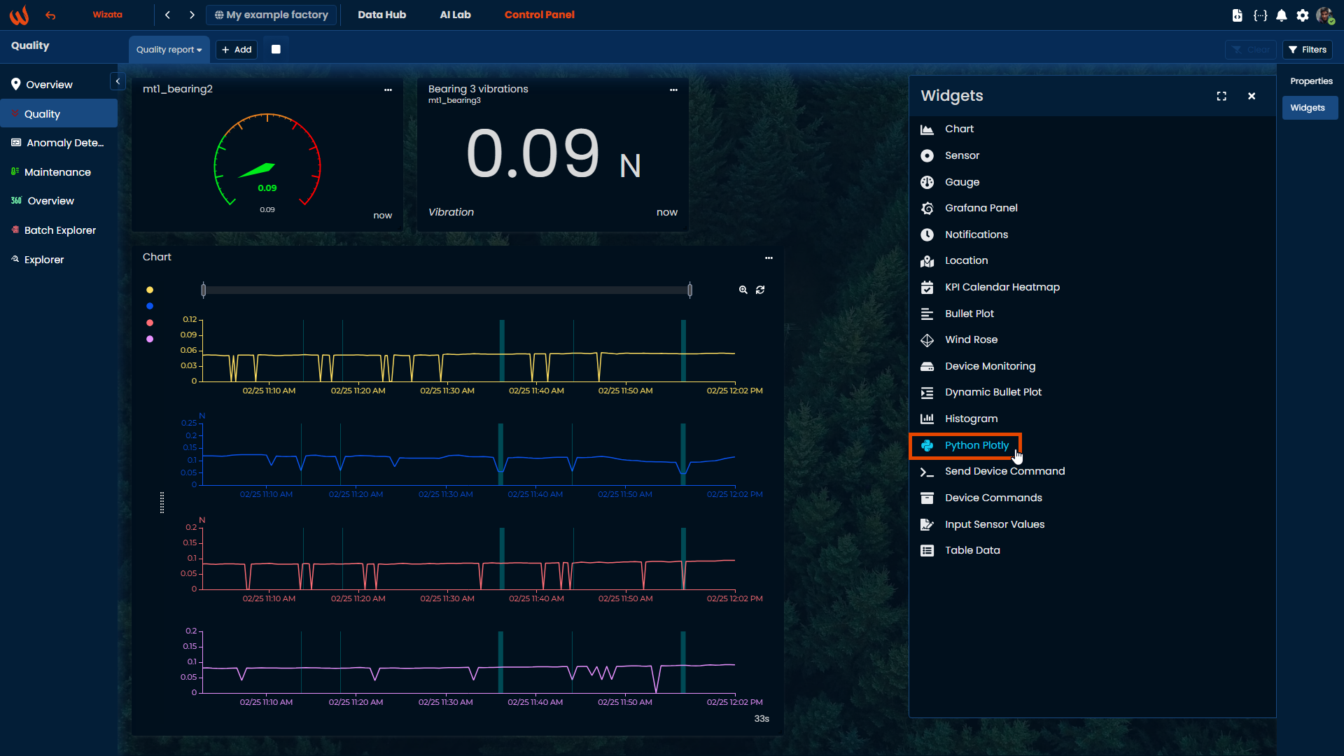
Create widget
To create the widget, simply select the "Python Plotly" widget on the right panel while and the application will create the widget at the bottom of the page.
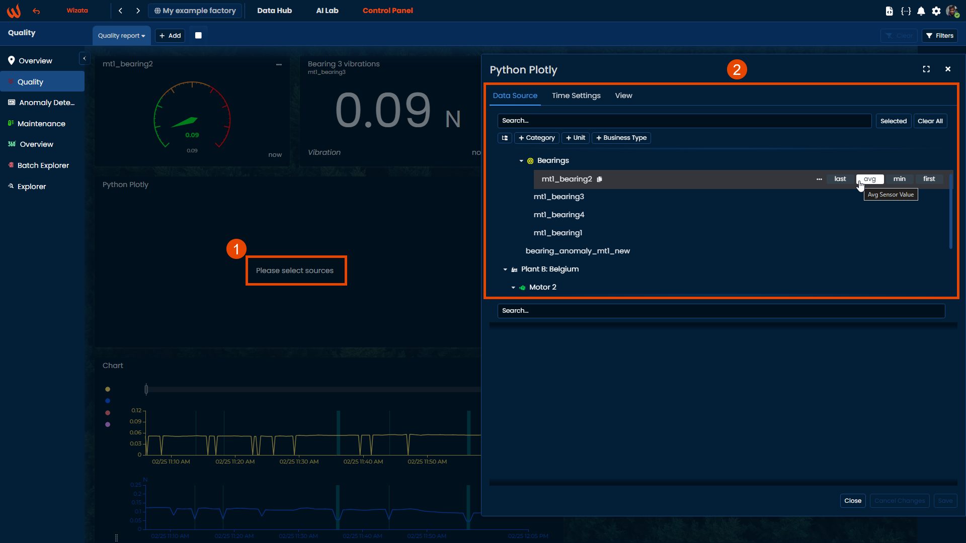
Data source tab
The data selection is exactly the same as any other data selection in the Wizata application. Hover the mouse on the datapoints to use in the plot and select the aggregation method to use in the data sampling.
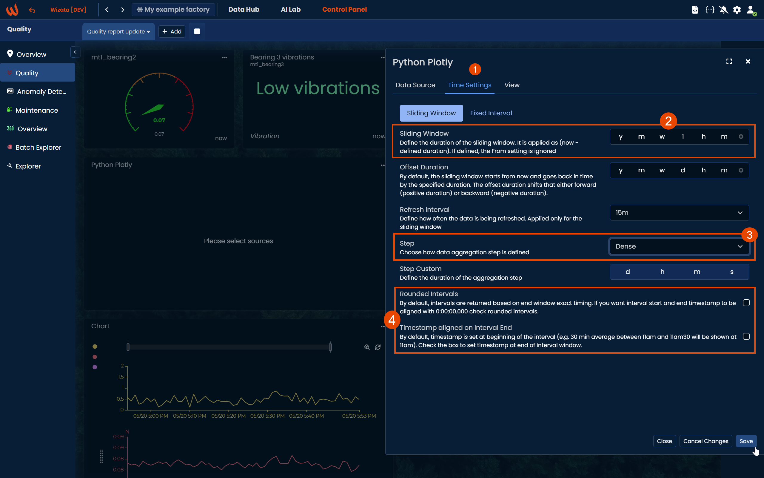
Time settings
Choose between a Sliding Window or a Fixed Interval to define the time range of data shown in the Plotly chart. You can also enable Rounded Intervals to align the start and end timestamps with exact hour marks (e.g., 00:00:00.000). Additionally, you may activate the Timestamp aligned on Interval End option to display the timestamp at the end of each interval instead of the beginning (which is the default behavior).
Data structure
As Python Plotly relies on Pandas dataframe structure, it's important to properly understand how Wizata application query engine prepares the data to be used by the Python interpreter.
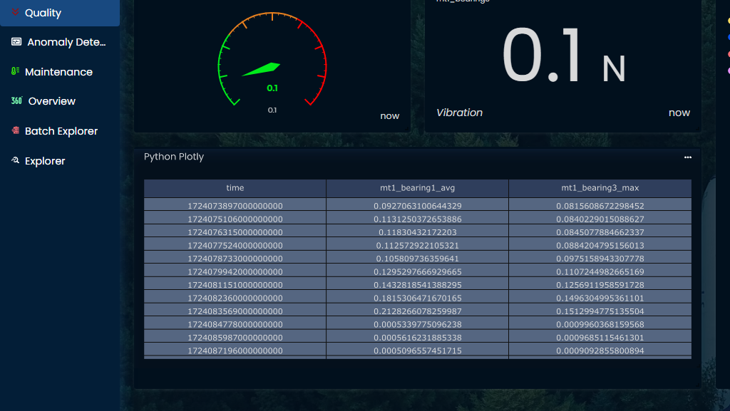
The query engine will always return the following format in a Pandas dataframe object name df.
- Timestamp as dataframe index. The index of the dataframe will be displayed as a Unix timestamp in UTC timezone, with nanoseconds format (example:
172467669500000000). - Selected datapoints as columns headers, with the aggregation method appended as a suffix to the tag name.
- Datapoints values in columns, calculated as specified by the aggregation method and interval.
The dataframe structure can be displayed very simply with this code sample:
fig = go.Figure(
    data=[go.Table(
        header=dict(values=df.reset_index().columns),
        cells=dict(values=df.reset_index().T.values))
    ])
fig.update_layout(margin=dict(l=0, r=0, t=0, b=0))
fig.show()
That will render the following result:
View - Python code
The "View" tab is the place to enter Python code. Users are free to use all the most traditional Python packages available for data science (Numpy, Scipy, Sklearn, etc.) and display results with Plotly library.
Users can input any code of their own development, or get inspiration from the open Plotly documentation.
Timeseries plot
A simple timeseries chart can be created with 2 lines of code.
fig = px.line(df)
fig.show()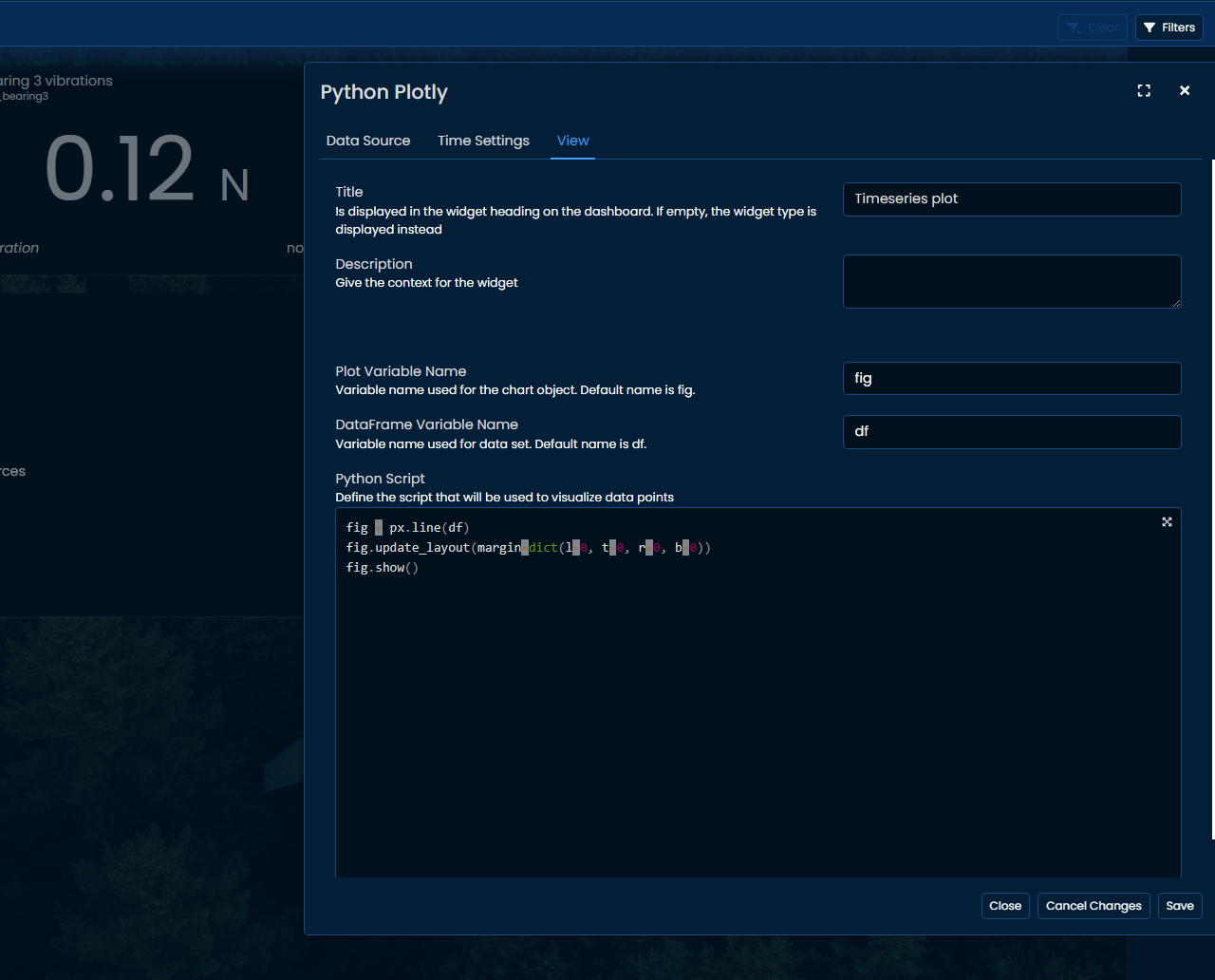
Rendering the following plot:
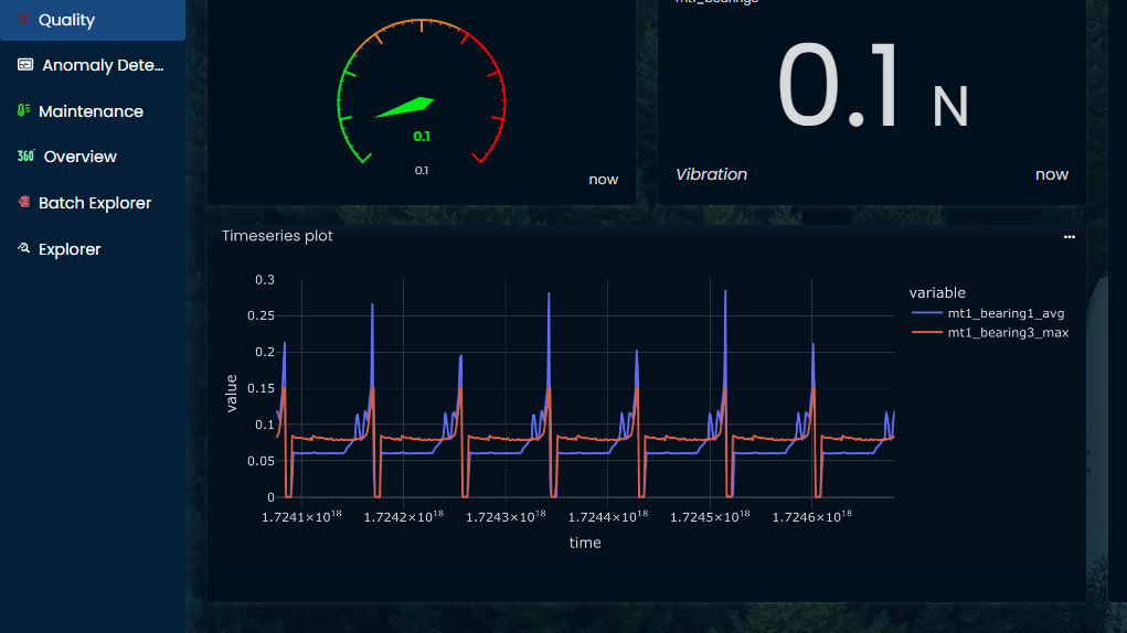
Time index doesn't look good in nanoseconds timestamp, adding this code will parse that to a more readable datetime:
df.index = pd.to_datetime(df.index)

fig = px.line(df)
fig.update_layout(margin=dict(l=0, t=0, r=0, b=0))
fig.show()
Distribution plot
Users can create more advanced plots using Plotly library, for which some data processing is required. Users can simply enter usual Python functions to process, calculate, filter, recode, etc. as illustrated in the following example:
# Set index as timestamp
df.index = pd.to_datetime(df.index)

# Add variable to define when motor is running
df["running"] = np.where(df["mt1_bearing1_avg"]>0.05, "running", "downtime")

# Plot to compare distribution when motor is running or not
fig = px.scatter(
  df, x="mt1_bearing1_avg", y="mt1_bearing3_max",
  marginal_x="box", marginal_y="violin", color="running"
)
fig.update_layout(margin=dict(l=0, t=0, r=0, b=0))
fig.show()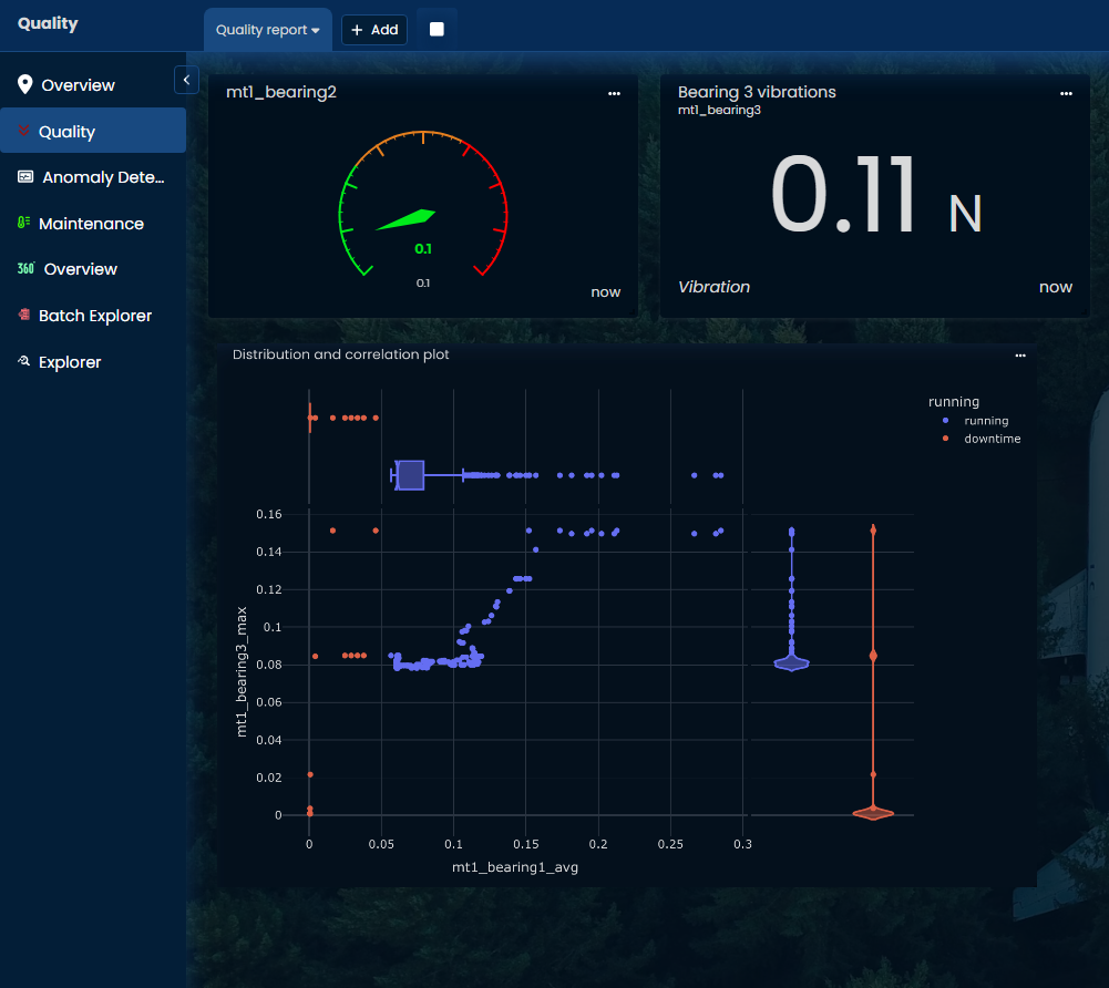
Updated 9 months ago