Call a pipeline from a Grafana dashboard
Additional to the possibility of querying data from Wizata in Grafana, we can also use the Wizata plugin integration to run a created Pipeline directly from your dashboard and show the results in a graph and also to run pipeline simulations with customized values.
Running a pipeline in Grafana
First steps: Configuring Pipeline Call
Please remember first to create the logic of your solution as a pipeline in the platform. In this case, we will be using the
bearing_anomaly_pipelinesolution from the tutorial, with the sample data that you can find in this article
Once we have created our pipeline solution, the next step is adding a new data source with the Pipeline Call as the query type. In the Explore section, you will see an empty payload field that needs to be filled:
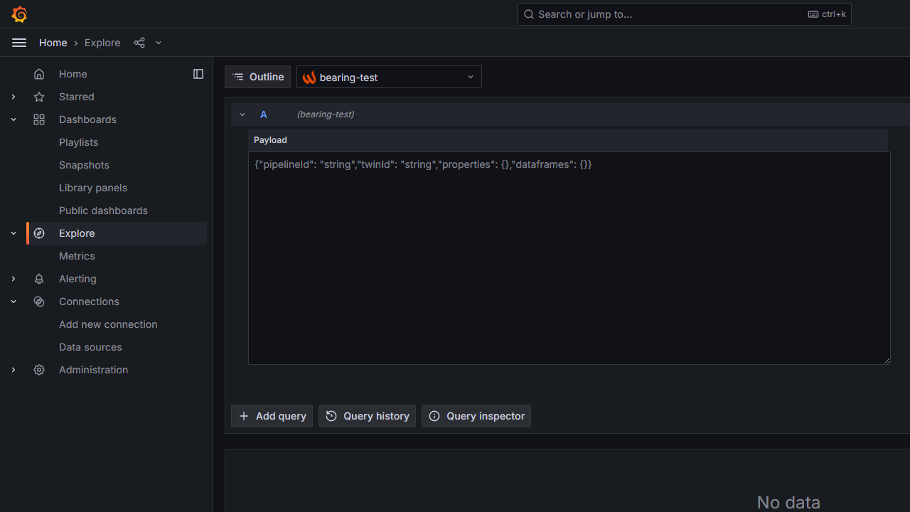
We will complete the JSON payload using information from our bearing_anomaly_pipeline. The pipelineId and the twinId for the specific unit where we will run the pipeline are mandatory fields, while additional fields like properties and dataframes can also be included.
Creating the JSON payload to run the sample data pipeline
To complete the JSON payload we will need to retrieve the pipeline and the twin ids. To find the pipelineId, we can either copy it from the query parameter in the URL of the specific pipeline:
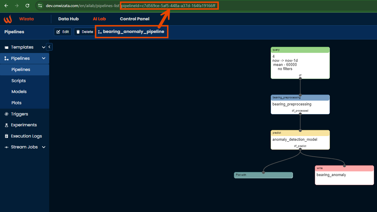
Or by using the Get all pipelines endpoint on the Documentation API Reference, filtering by the specific pipeline key (in our sample case we will use bearing_anomaly_pipeline)
Additionally, we can do the same for the twinId. In our sample case, we will create the payload for the Motor 1:
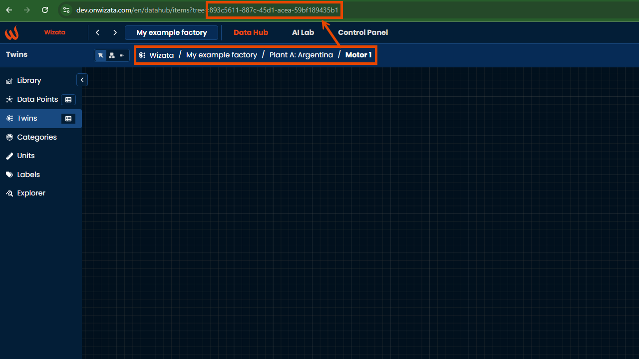
Or by using the Get paged twins in the API Reference, passing the twin's name orhardwareId as query parameters.
To fill the properties names, we will use the template properties defined in the template creation. In our case, we will match the properties from the anomaly detection solution, adding Threshold and Bearing_properties customized variables.
Adding customized Grafana variables to the pipeline call
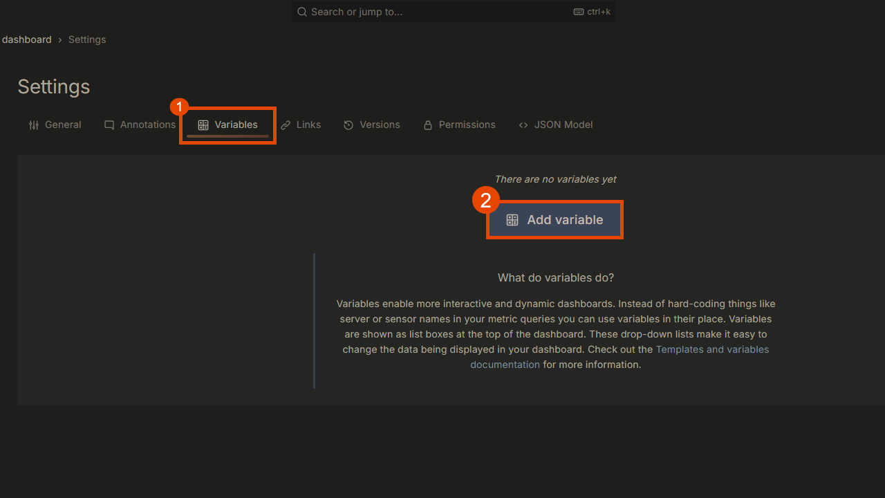
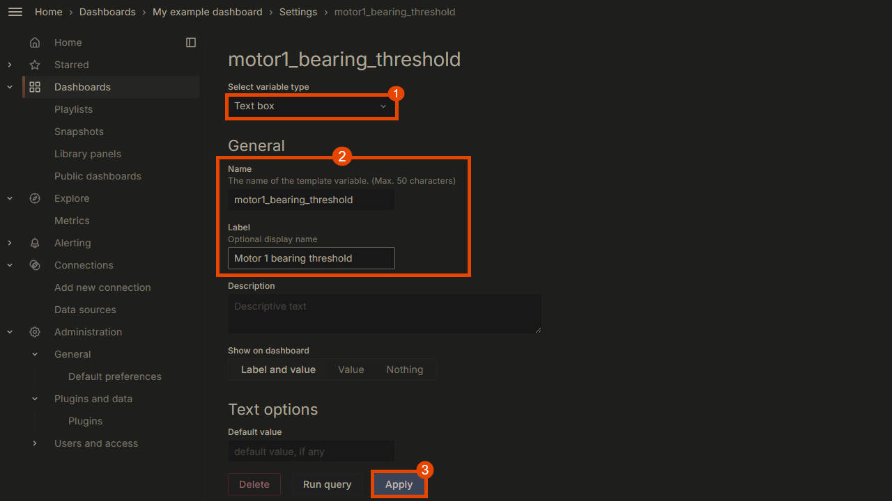
To add customized variables to your Grafana dashboards, navigate to the Dashboard settings -> Variables -> Add variable.
We will create a custom Text box variable for the motor 1 bearing's threshold, as shown below:
Next, replicate this process for Bearing_properties, creating separate variables for pressure and another for temperature. Once done, save the dashboard, and the changes will automatically apply.
Now, we will generate the pipeline data source graph using the variables defined in the JSON payload. To do this, click Add -> Visualization and select the Pipeline Call data source. In the payload field, use the following JSON structure:
{
  "pipelineId": "c7d569ce-5af5-448a-a37d-164fa19166ff",
  "twinId": "893c5611-887c-45d1-acea-59bf189435b1",
  "properties": {
    "Threshold":"@motor1_bearing_threshold",
    "Bearing_properties": {
      "bearing_pressure_threshold":"@motor1_bearing_pressure",
      "bearing_temperature_threshold": "@motor1_bearing_temperature"
    }
  }
}
Each customized variable will be declared as a string, starting with an at sign (@) followed by the variable name defined in the text box variable option. Once we finished with the configuration, we will refresh the dashboard to see the results:
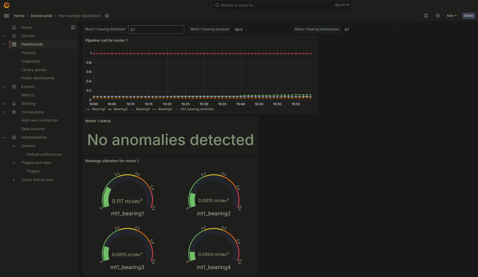
If the anomaly datapoint value in the chart is 1, it indicates that no anomaly has been detected. You can modify the graph type in the configuration settings.
We can further expand our example by creating custom variables for the different bearings to simulate potential anomaly detections with predefined values. To achieve this, we will utilize the dataframes object in the JSON payload, filling the dataframe input from the pipeline query with our custom values.
In our sample query from the Anomaly Detection tutorial, the dataframe was named
df. We will use that name as the object passed in thedataframesvariable.
Once we have set up the values in the Grafana dashboard, the payload field that will use the following JSON structure:
{
  "pipelineId": "c7d569ce-5af5-448a-a37d-164fa19166ff",
  "twinId": "893c5611-887c-45d1-acea-59bf189435b1",
  "dataframes": {
    "df": {
      "Bearing1": "@Bearing1",
      "Bearing2": "@Bearing2",
      "Bearing3": "@Bearing3",
      "Bearing4": "@Bearing4"
    }
  }
}
Here is how the Stat graph will look like:
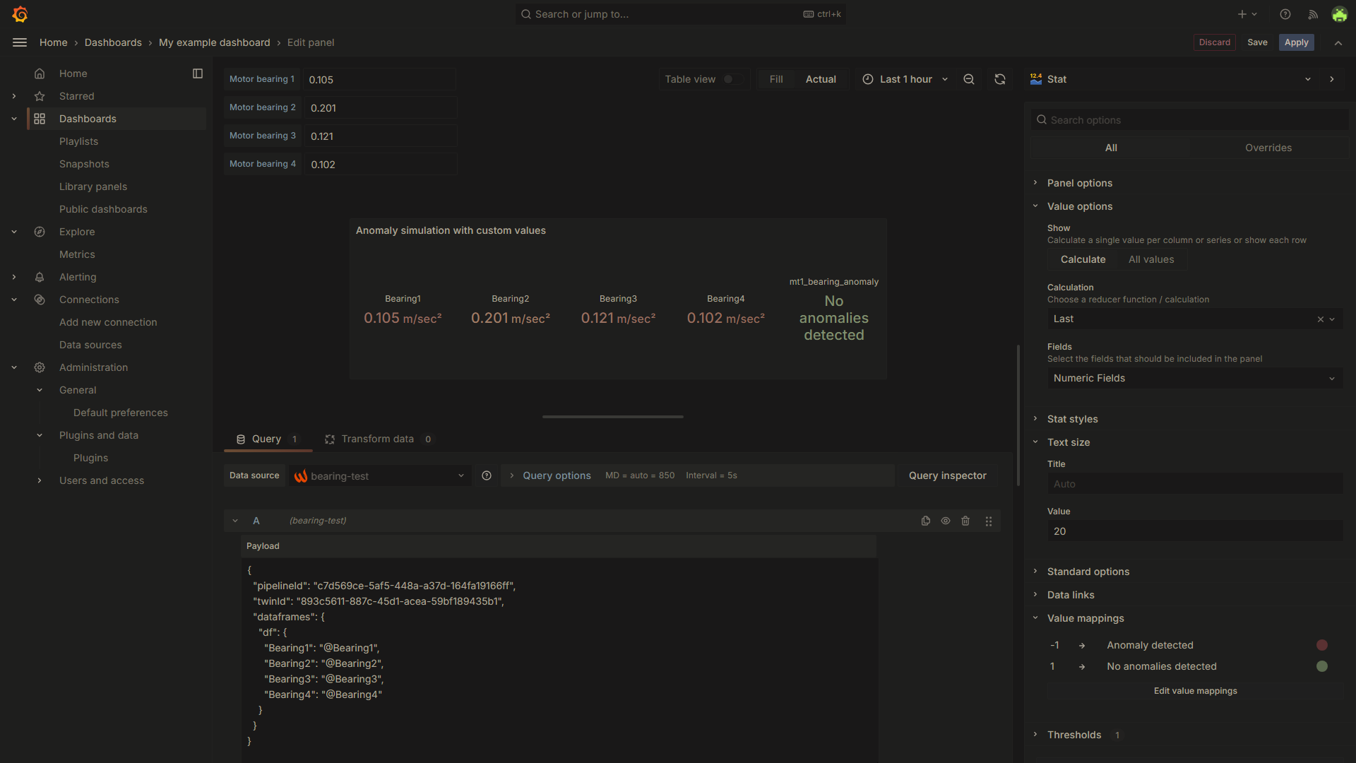
Every time you modify a value in the text box, make sure to refresh your dashboard to reflect the changes in the graph.
Updated 9 months ago