Chart widget
The chart widget can be used to display timeseries data.
The configuration screen contain 4 tabs to control different aspects of the chart.
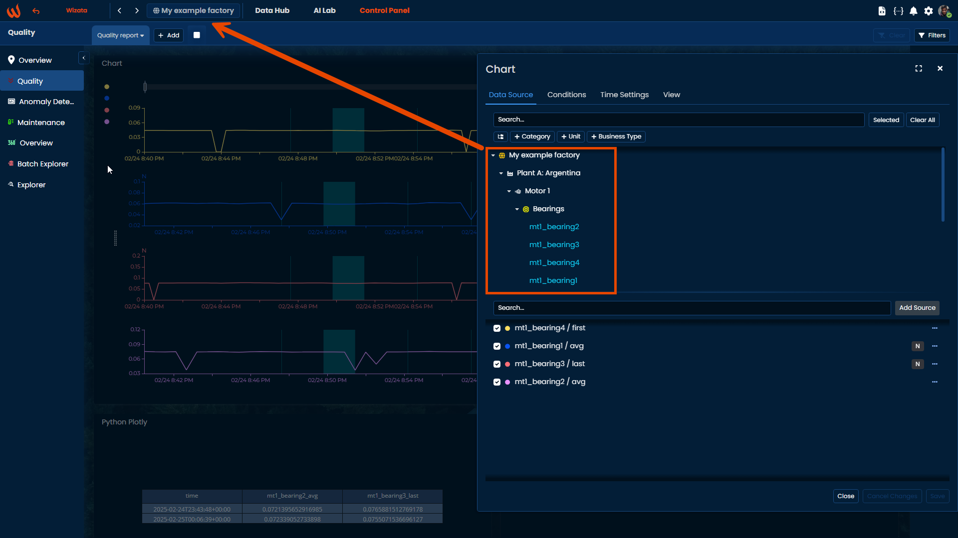
Data Source
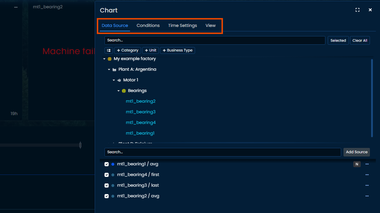
This menu allows to select which datapoints to be displayed on the timeseries chart.
To select a datapoint to add on the chart, hover the mouse on the datapoint, and click on one of the proposed aggregation method (by default, chart widget displays aggregated data to minimize load time, but raw data can be selected in Time Settings if needed).
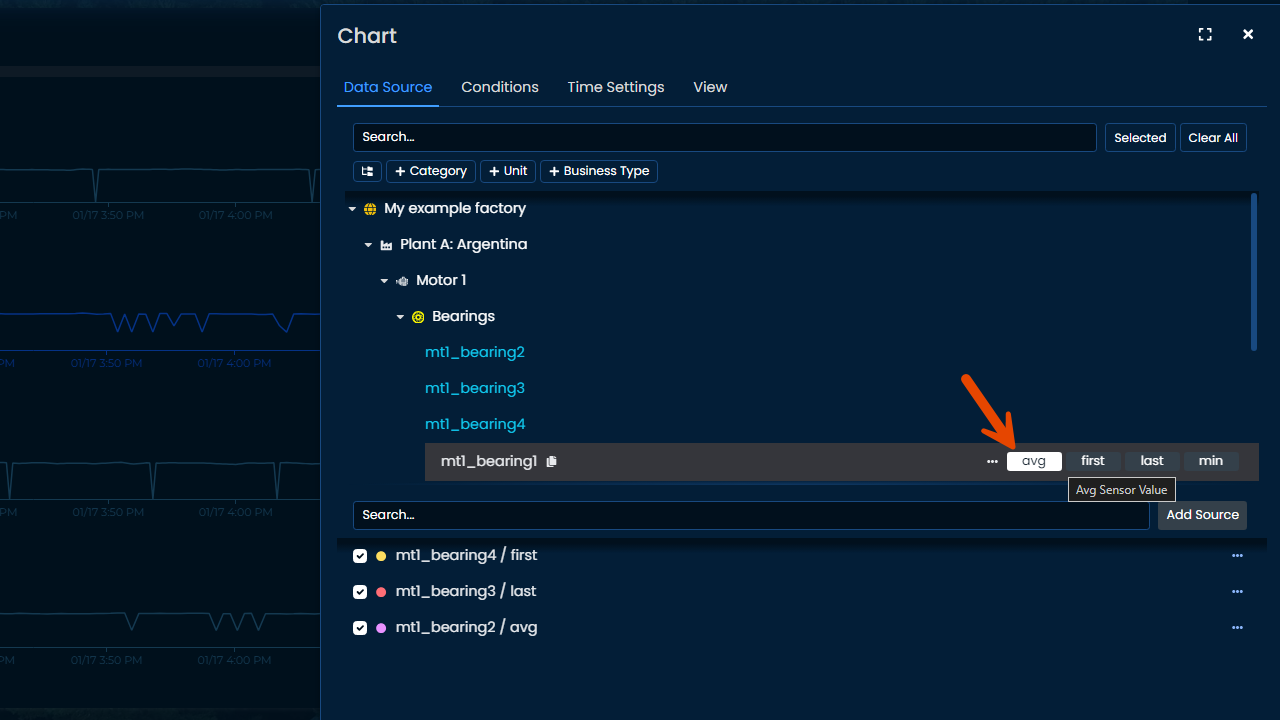
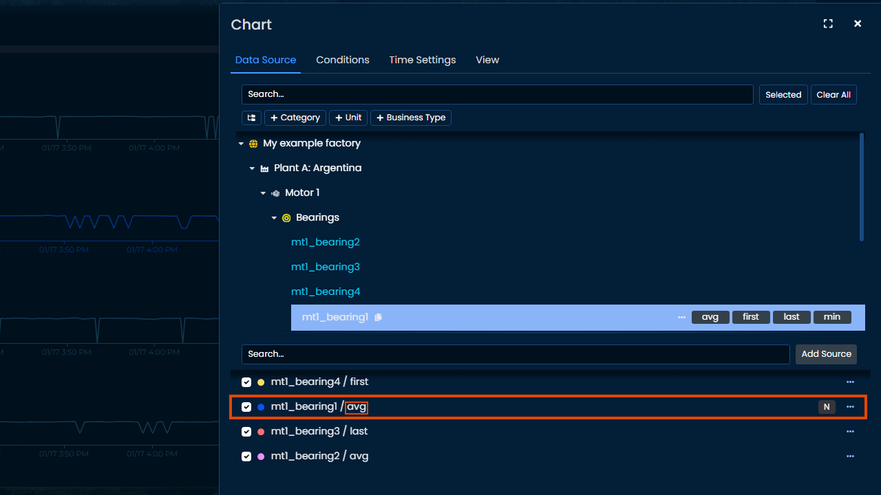
Once clicked, the selected datapoints and their aggregation method appear on the bottom part of the configuration screen, allowing for more advanced configurations.
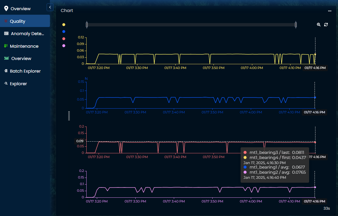
Clicking "Save" will generate directly the chart with default settings.
Conditions
Add a visual condition to highlight some events on the chart by clicking on "Add Condition".
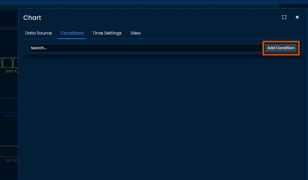
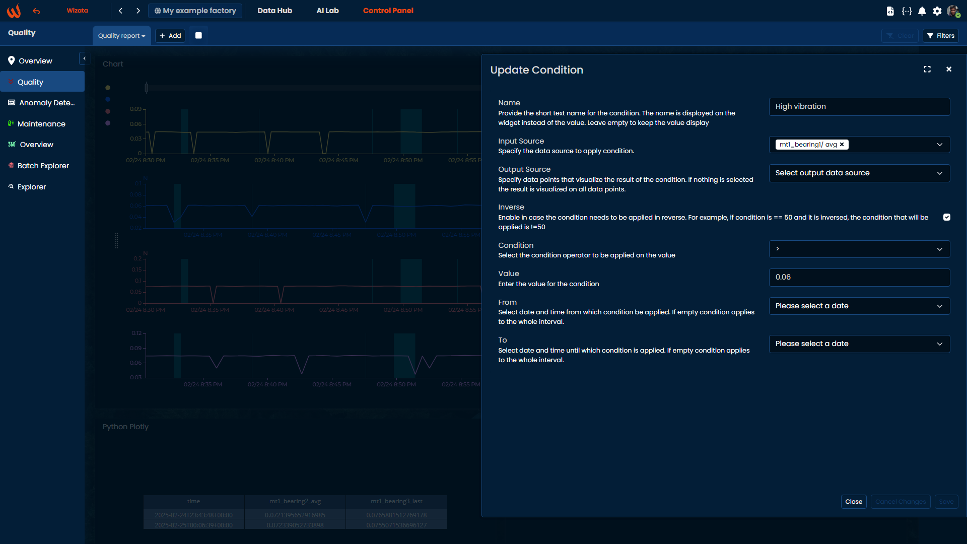
Fill the required information and save. In the following example, we created the following condition:
-
Name: High vibration
-
Input Source: Which datapoints to use for the condition (in this case the vibration sensor)
-
Output Source: You can select on which subchart to display the condition, or leave it empty to display on the whole chart.
-
Condition: Select the operator (<, >, ==, !=, >=, <=, etc.)
-
Value: Input the value to compare with the selected operator on the datapoints (in this example, we highlight when vibration is above 0.06N)
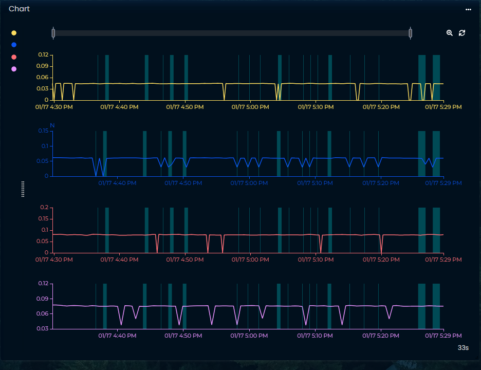
The result will display boxes at periods of time where condition is met.
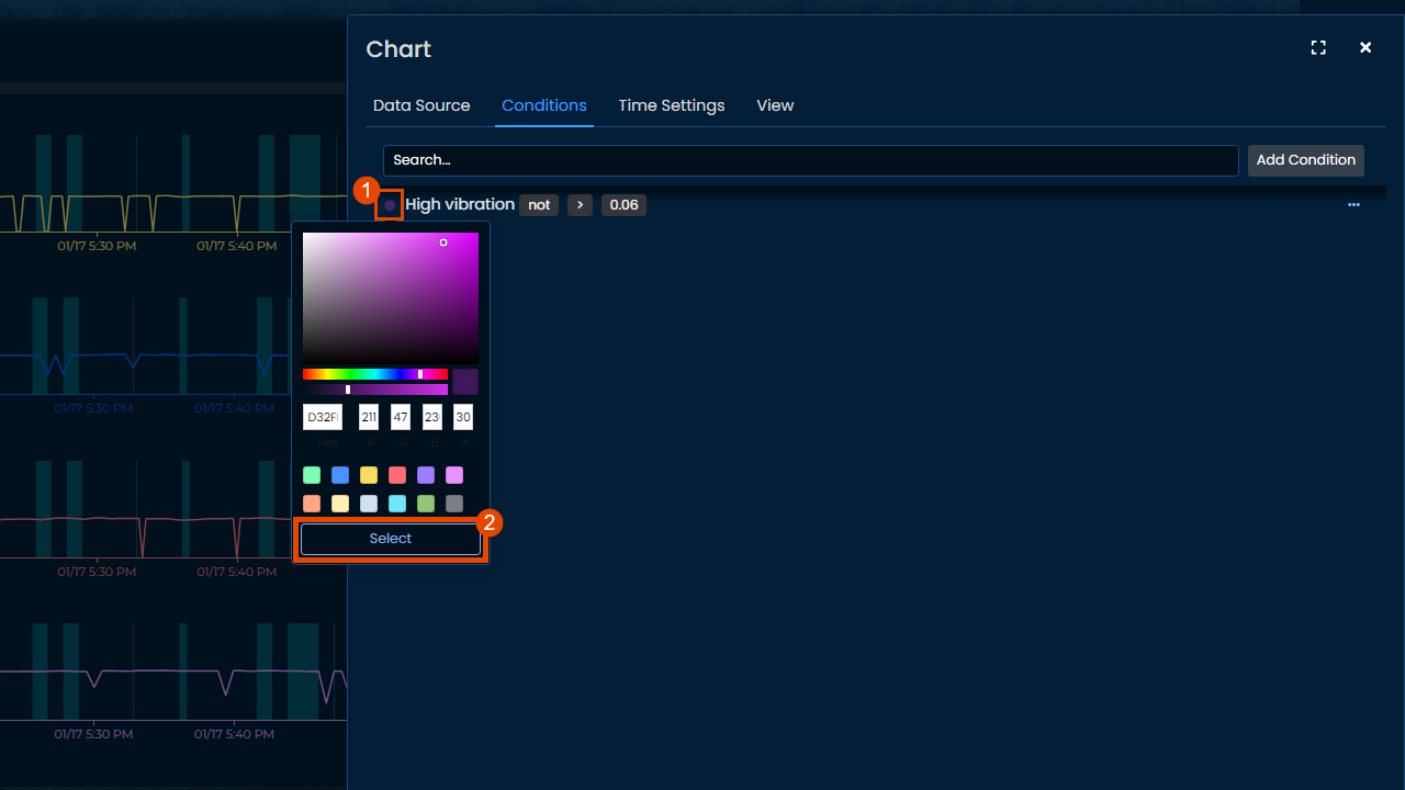
Conditions can be edited afterwards by clicking on the color box to change color, and on the 3 dots to change condition parameters.
Time Settings
By default, chart widget displays that last 1h of data, with a "smooth" aggregation window. This can be edited by filling the information on that page.
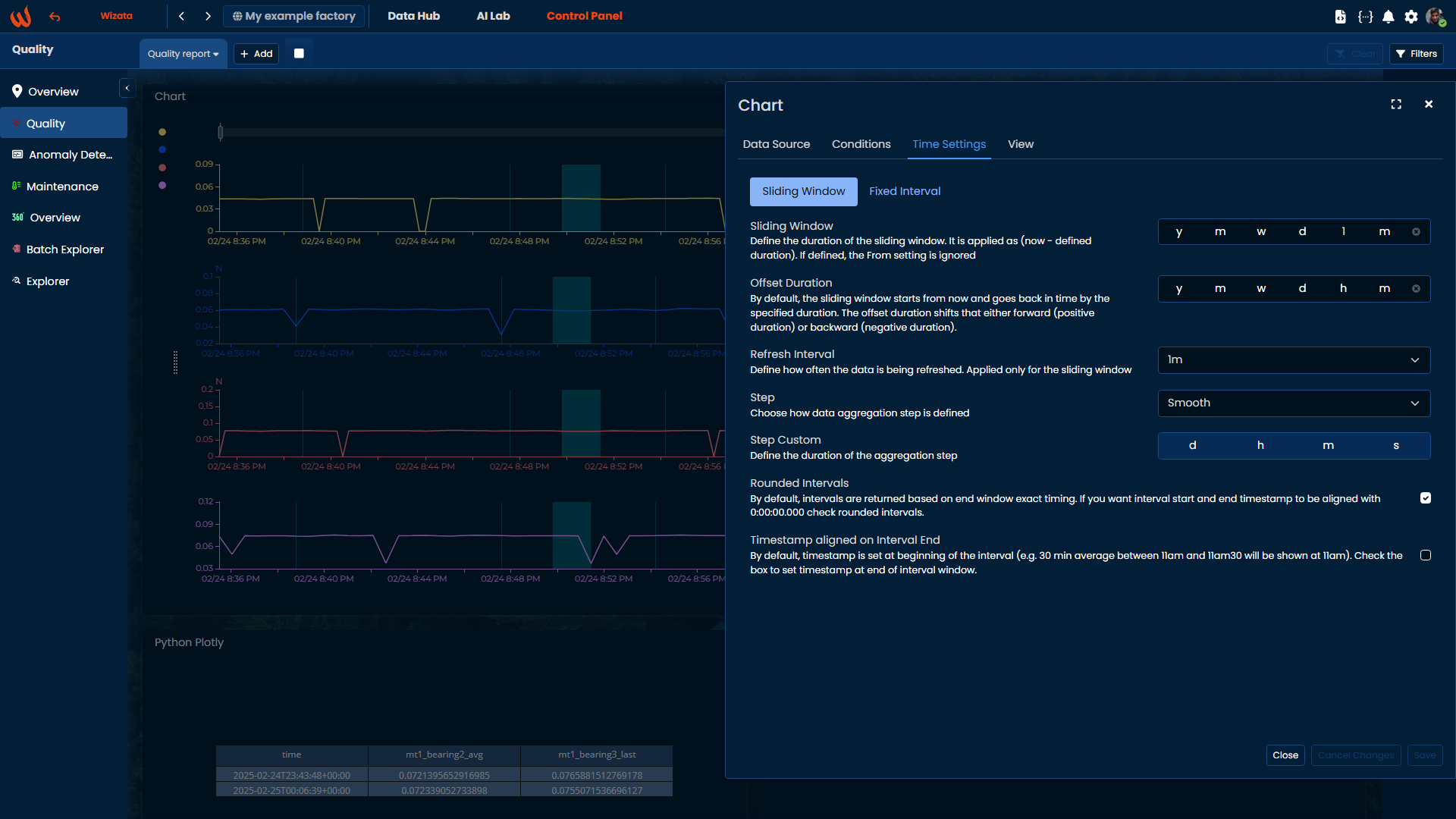
- Sliding window: Select the duration between now and a moment in the past by filling numbers into the corresponding fields (examples: 1w for 1 week, 1d 12h for 1 and a half day, etc.)
- Offset duration: Shift the data to change the moment the sliding window start
- Refresh interval: Frequency of widget data refresh
- Step: Duration of time aggregation interval
- Smooth: Default value, smoothes the data to produce fast loading widget (auto-calculated based on screen size)
- Dense: Creates smaller time intervals in which data is aggregated, displays more detailed/granular data (auto-calculated based on screen size)
- Custom: Define more precise aggregation interval if smooth or dense don't suit the usage. For example 1min, 3hours, etc.
- Raw: Displays as much data as possible based on screen size, data is sampled if too much raw to display
- Rounded intervals: By default, intervals are returned based on end window exact timing. If you want interval start and end timestamp to be aligned with 0:00:00.000 check rounded intervals
- Timestamp aligned on interval end: By default, timestamp is set at beginning of the interval (e.g. 30 min average between 11am and 11am30 will be shown at 11am). Check the box to set timestamp at end of interval window
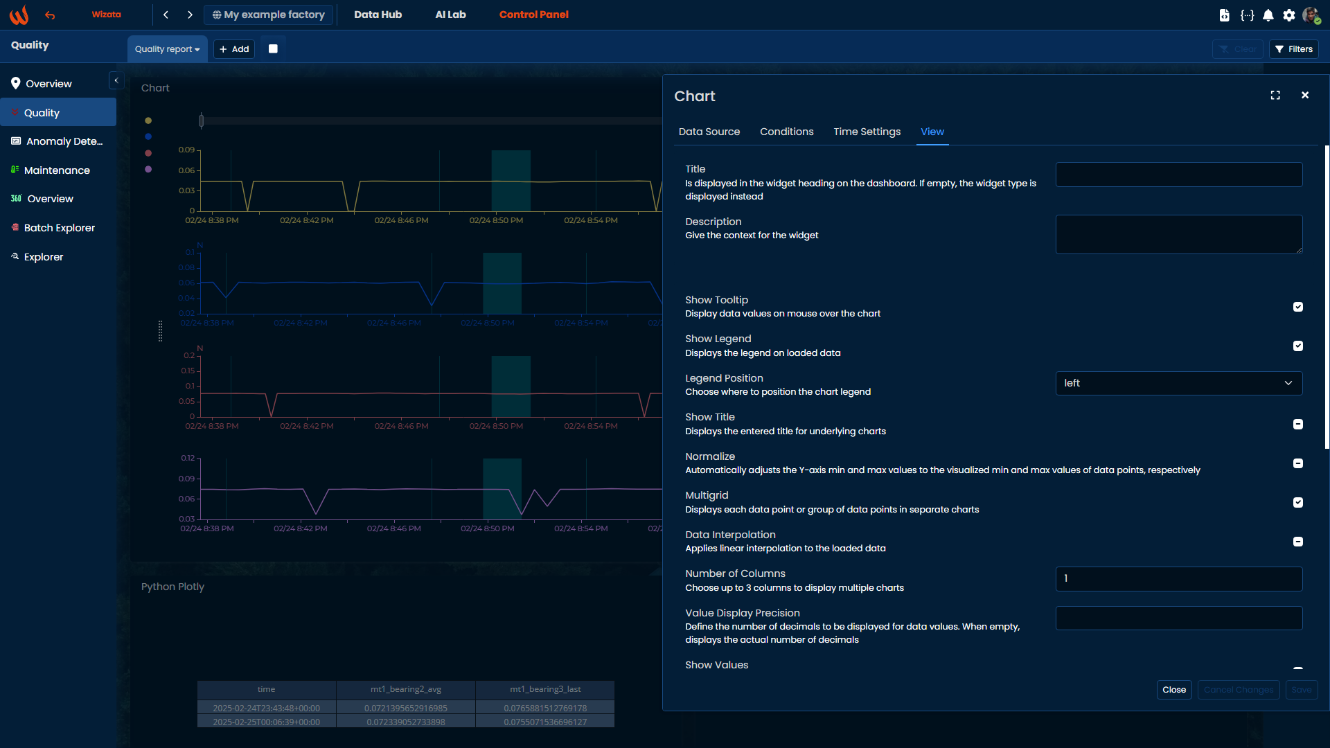
View
The View tab gives options to apply on the whole chart. They consist of visual options (layout, legends, title, etc.) or data options (normalization, interpolation...)
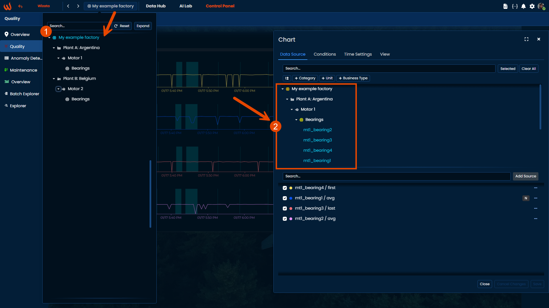
Datapoints filtering
The datapoints list is by default filtered to display only the ones attached to or below the selected asset with the top-left asset selector.If more datapoints need to be added, outside of the selected asset, simply navigate to other level of the Data Hub tree to display more datapoints in chart list.
Updated 9 months ago
What’s Next
Don't need to see complete timeseries? Check how to display last known value!