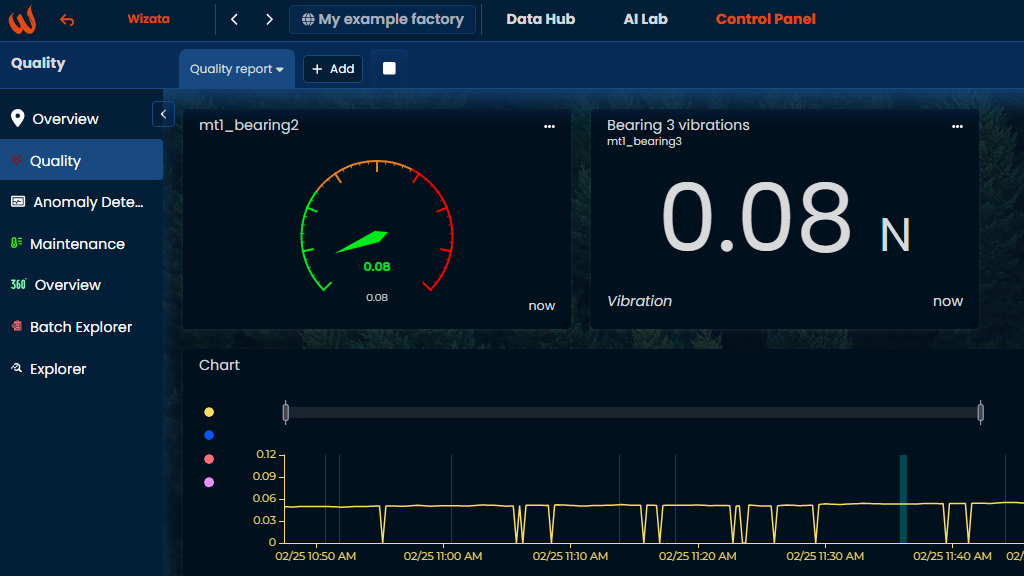
Gauge widget
A gauge widget simply displays the last know value of any selected datapoint on a visual gauge. This widget is useful to get a direct view on absolute values in live, with possibility to highlight ranges of interest value to pass the information as fast as possible to whom needs it.
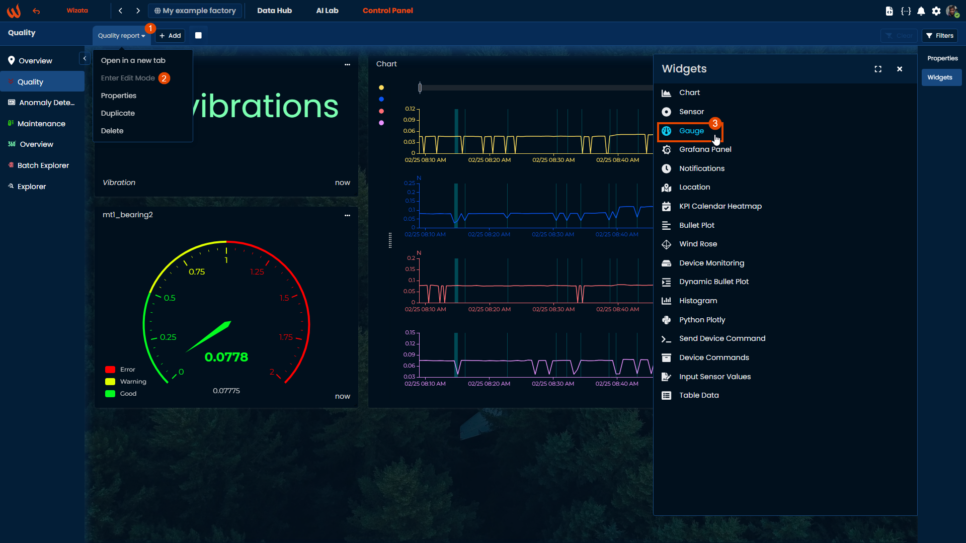
Create the widget
As any other dashboard widget, simply enter "Edit mode", open the widgets menu on the right bar, and select "Gauge". The widget is automatically created at the bottom of the current dashboard.
Configure the widget
Enter the widget configuration with the 3 dots button on the top right of the widget, and fill the required information to display the datapoint value on a gauge.
A simple version of the visual can be obtained by filling just the following 4 main fields:
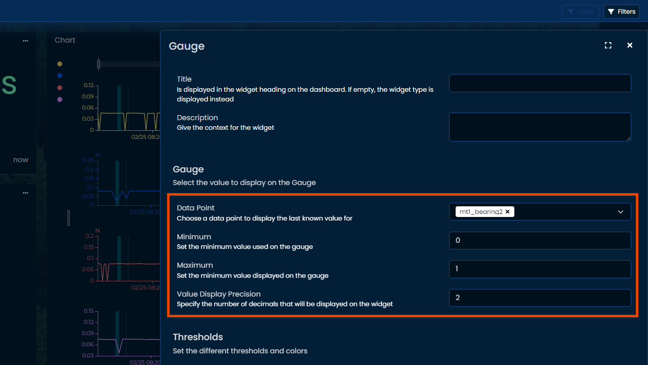
- Datapoint allows to select which signal to plot
- Minimum and maximum define the total range covered by the gauge
- Value precision sets number of decimals displayed on the value field
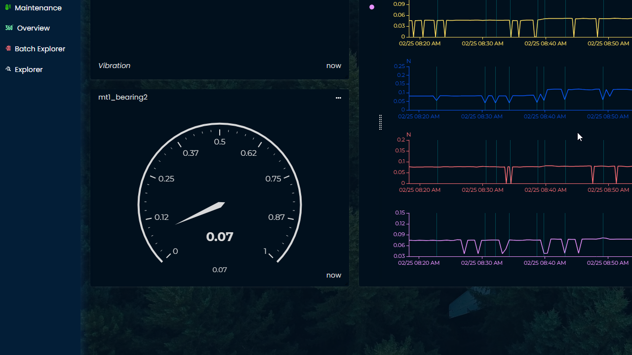
This configuration renders the following result:
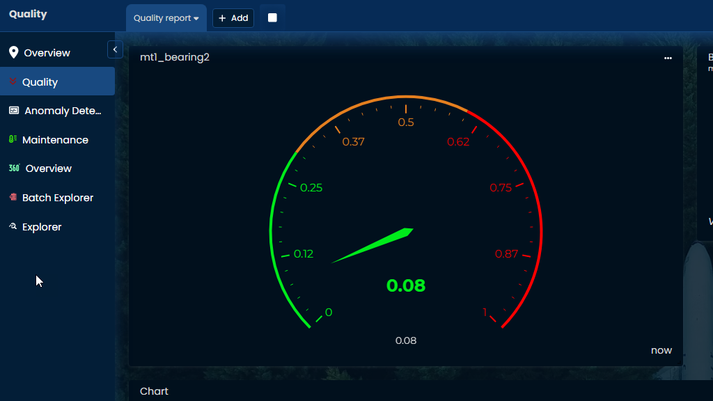
Add colored ranges to the gauge
To add colored ranges, click on "+ Add threshold" on the widget configuration screen. Click as many times as needed for all the desired ranges.
For example, the previous range is between 0 and 1, and this example creates 3 ranges of values.
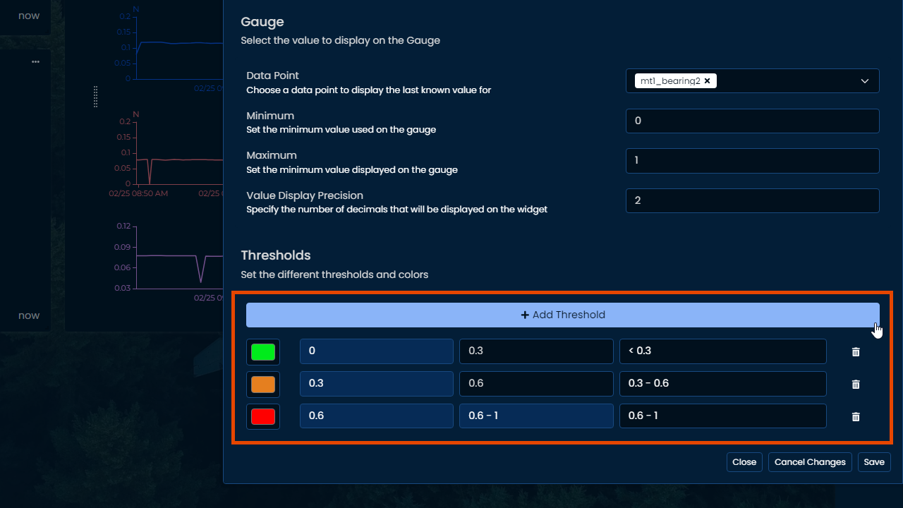
The colors can be simply selected by clicking on the color rectangle next to each range.
Saving the widget renders the following result:
Showing more graduations
The gauge widget can be set to display intermediate values by simply making the widget bigger. To increase size, click and hold on bottom-right corner to stretch to the desired size, and after a sufficient increase the intermediate values will be displayed.
Updated 9 months ago
What’s Next
Need more advanced and customized visual? Check out on Python Plotly integration!