Data Explorer
As you might already read in the Exploring data article, the Data Explorer enables you to set specific conditions on your charts, making it simpler to spot outliers or verify assumptions drawn from the data. Furthermore, it offers tools to create and customize data sources directly within the platform, ensuring you have full control over how your data is visualized and analyzed.
In this article, we will provide a detailed overview of the capabilities of the Data Explorer and how you can leverage its features to maximize your data analysis.
Choosing the right data to visualize
In the top-left corner of the explorer, you will find a dedicated search area to locate datapoints on the platform whose live data you want to view. You can use the search bar to find specific datapoints, browse those associated with a particular twin, or filter them by categories, units or business type.
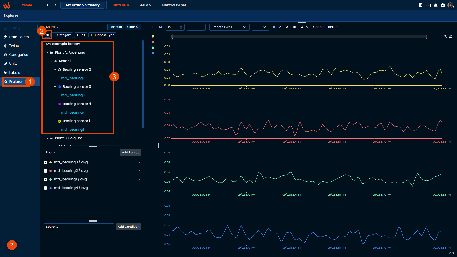
If you want to know how to associate datapoints to a particular twin, we have a whole dedicated article.
Once you hover over the datapoints you want to view, various aggregation methods for data visualization on the graphs will appear:
| Aggregation method | Description |
|---|---|
avg | The most common option: The avgfunction calculates the average, or arithmetic mean, of its arguments. |
min | The min function finds the minimum value. |
max | The max function finds the maximum value. |
sum | The sum function calculates the sum of its arguments. |
first | The first function finds the first datapoint value in each period of time. |
last | The last function finds the first datapoint value in the each period of time. |
stdDev | The stdDev function calculates the standard deviation of its arguments. |
count | The count function finds the amount of datapoints values in each period of time. |
In our example, we will choose the avg function for each datapoint sample graph. For default, every datapoint chart will get a random different color, but we can change multiple properties. We will explain more in details in the next section Transforming data visualization

Transforming data visualization: Data source
If you have already selected the datapoints to explore from the platform, you will see the list of data sources in the mid-left corner. In this section you can group different data points, modify their properties, adjust chart properties and add calculated data points from formulas or PythonScript .
To group datapoints into a single graph, simply drag and drop one datapoint onto another. This action automatically creates a Group folder where you can add as many datapoints as needed, all of which will be displayed on the same graph.
If you hover over the ... icon, you will see options to delete a data source from the explorer, edit the data source's name, data type, and fixed start/end time, and use the paintbrush icon to modify the data source properties and adjust data views.
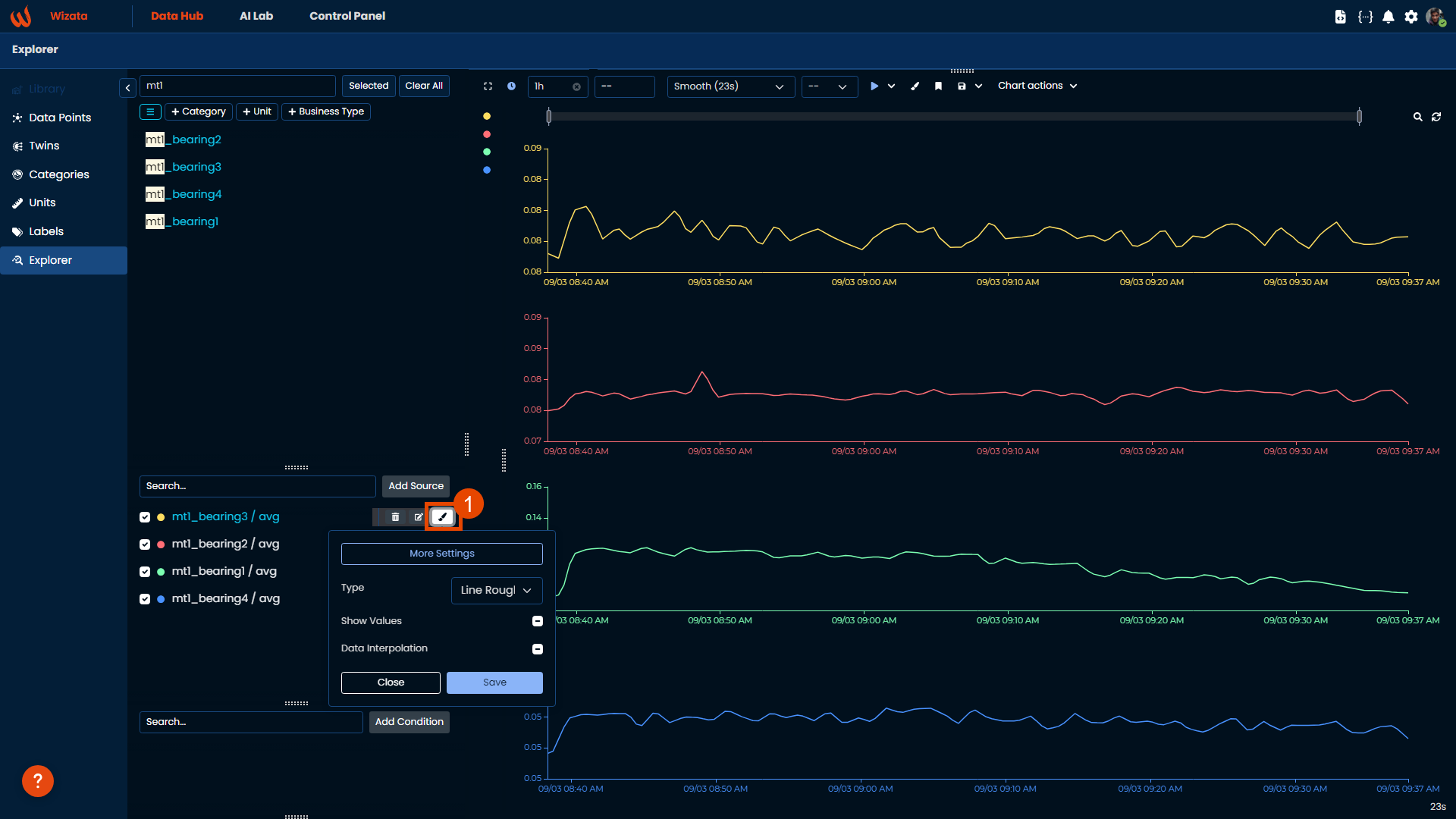
Within the basic settings, you can change type of graph, choose to display values and enable data interpolation, to estimate values within the range of the known data.
If you want to check the evolution of a data over time, you can pick Line, Line Rough or Line Step. The difference between the three types of lines is the interpolation method used to connect the data values. You can use a Bar chart to see the evolution of a cumulative data point over time. The Scatter plot will show you the relationship between two data points. You will be able to explore correlations with this type of plot. A Histogram will give you an insight of the distribution of values for a data point. Also, you will be able to identify outliers with this type of plot.
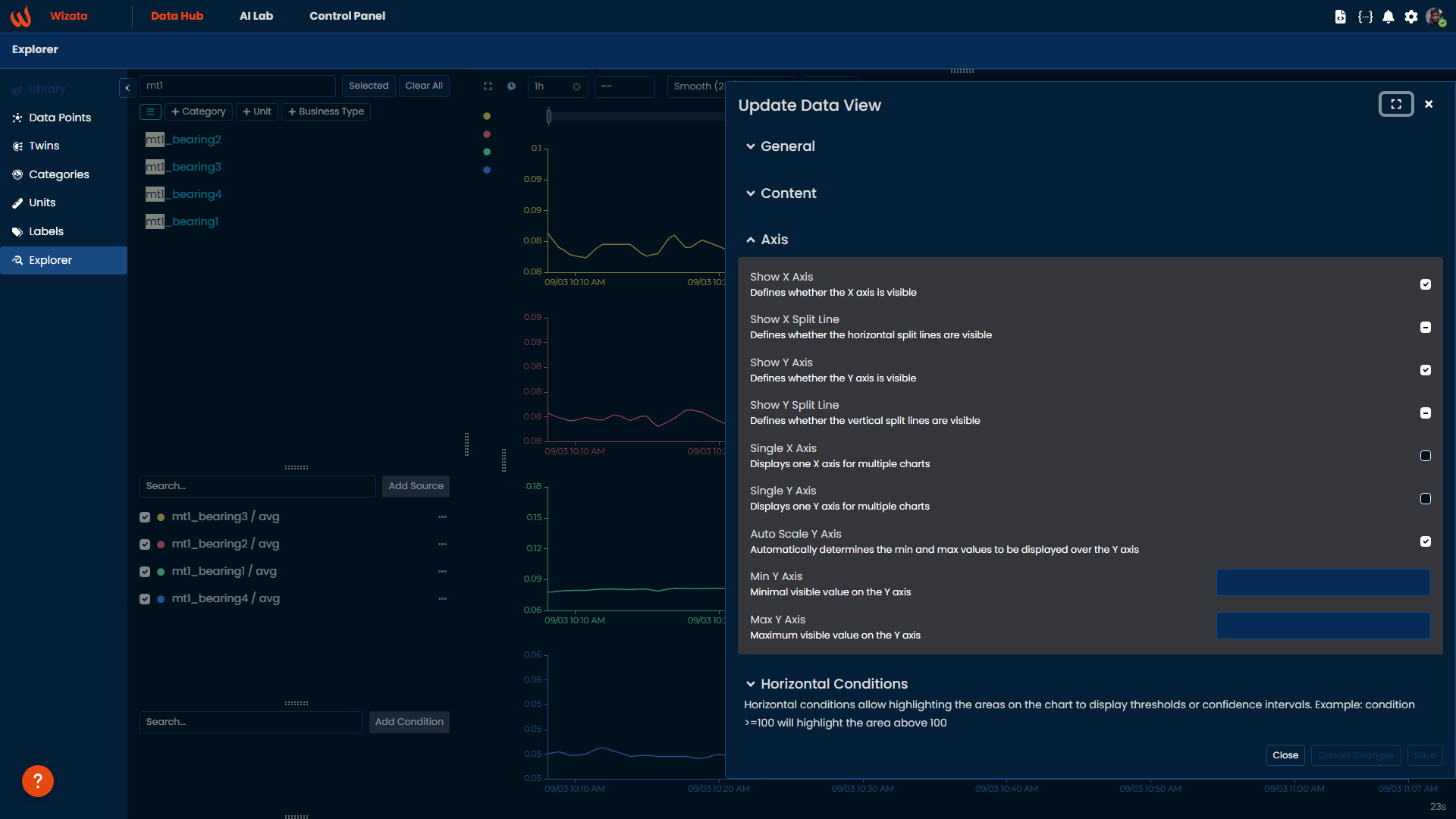
You can also aim for more advanced configurations to update the data view. Among the available options, you can apply a time shift to visualize data with adjusted timestamps, and customize chart colors. In terms of content, you can define display precision by setting the number of decimal places and decide whether to remove null values. The axis configuration allows you to toggle the visibility of the X/Y axis and split lines. Additionally, you can highlight specific areas on the chart by setting horizontal conditions, such as marking thresholds, and you can add up to five linear regressions to analyze trends based on recent data points.
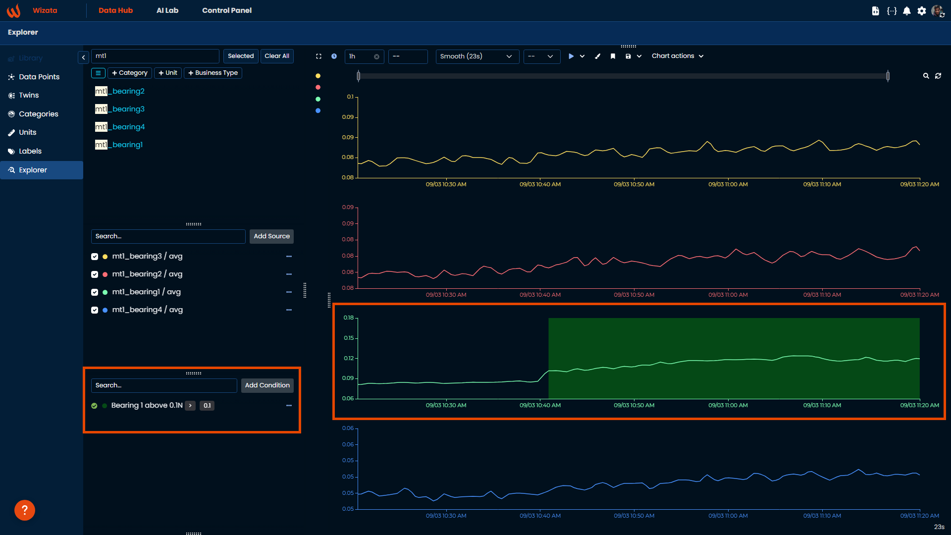
Conditions
We can also apply conditions that will be visible each time you open the explorer for a specific datapoint graph. For example, in our data sample, we can create a condition to highlight when the motor's bearing 1 exceeds 0.1 N
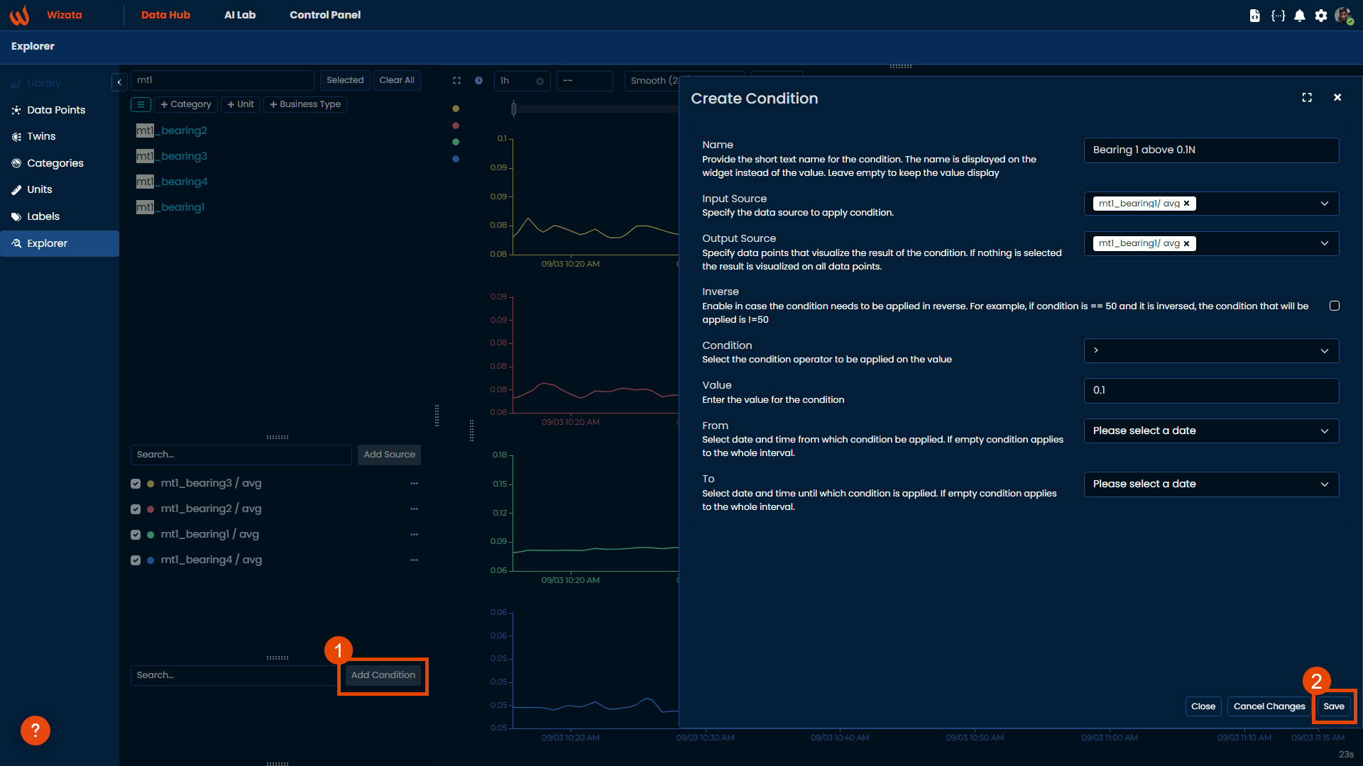
Once the condition is set, it will appear in the bottom-left corner and be marked on the explorer graph. In this case, we chose to display the condition only for the mt1_bearing1 datapoint, but you can opt to show it across all charts if needed.
Time interval and granularity of the displayed data
Explorer offers multiple ways of fetching between time intervals to visualize your datapoints. To select the period for displaying the data, you can enter a number in the relevant field in the Sliding Window at the top-middle of the explorer panel.
If you need to display data for a specific period, then сlick on the clock icon on the top menu of the charts element, to select a time interval of the data. Or, if you prefer, use the 5 default options (Last Hour, Last Day, Last Week, Last 30 Days or last 90 days on the left-hand side).
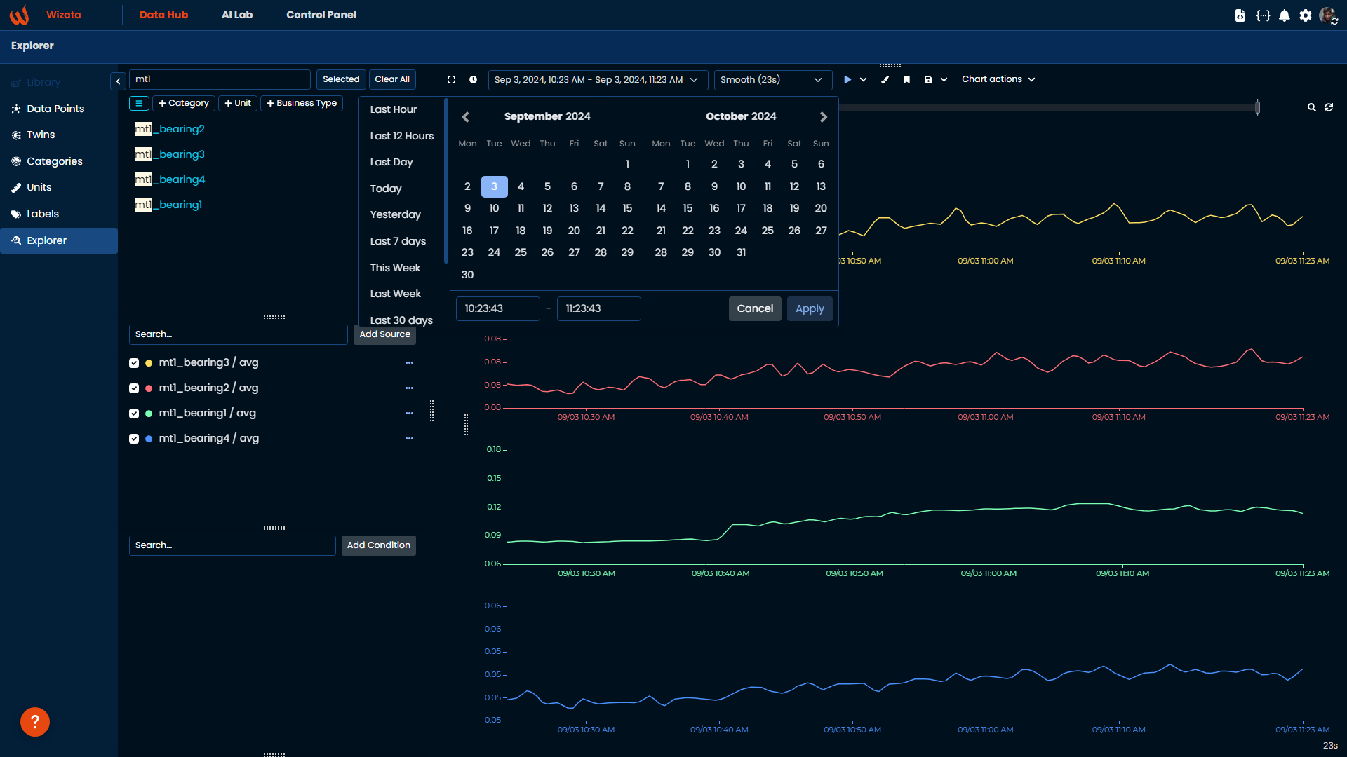
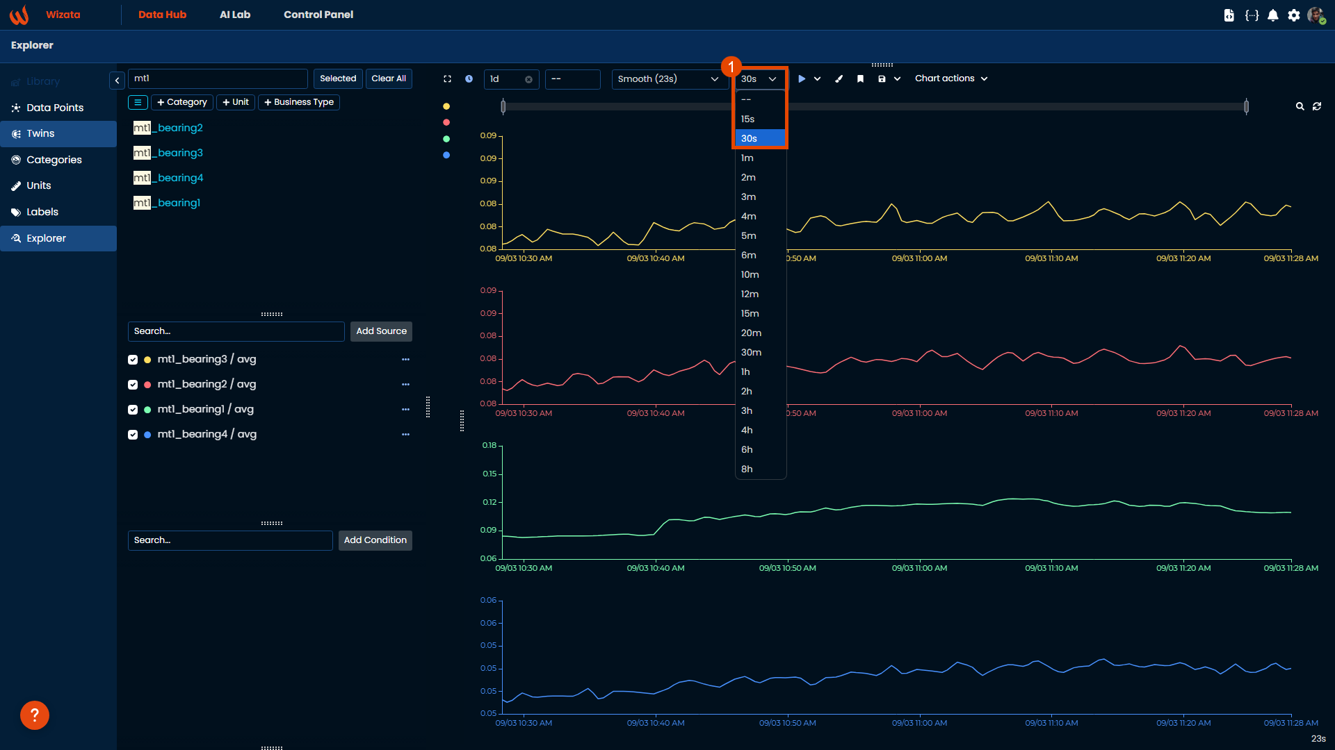
The top menu of the Charts element also allows you to select the granularity of the data. This way you can adapt it to the selected time interval and see the data in that granularity that shows the phenomenon you are studying. If you select Custom, you will be able to input the granularity yourself by day, hour, minute and second. In this case, we will put 30 seconds.
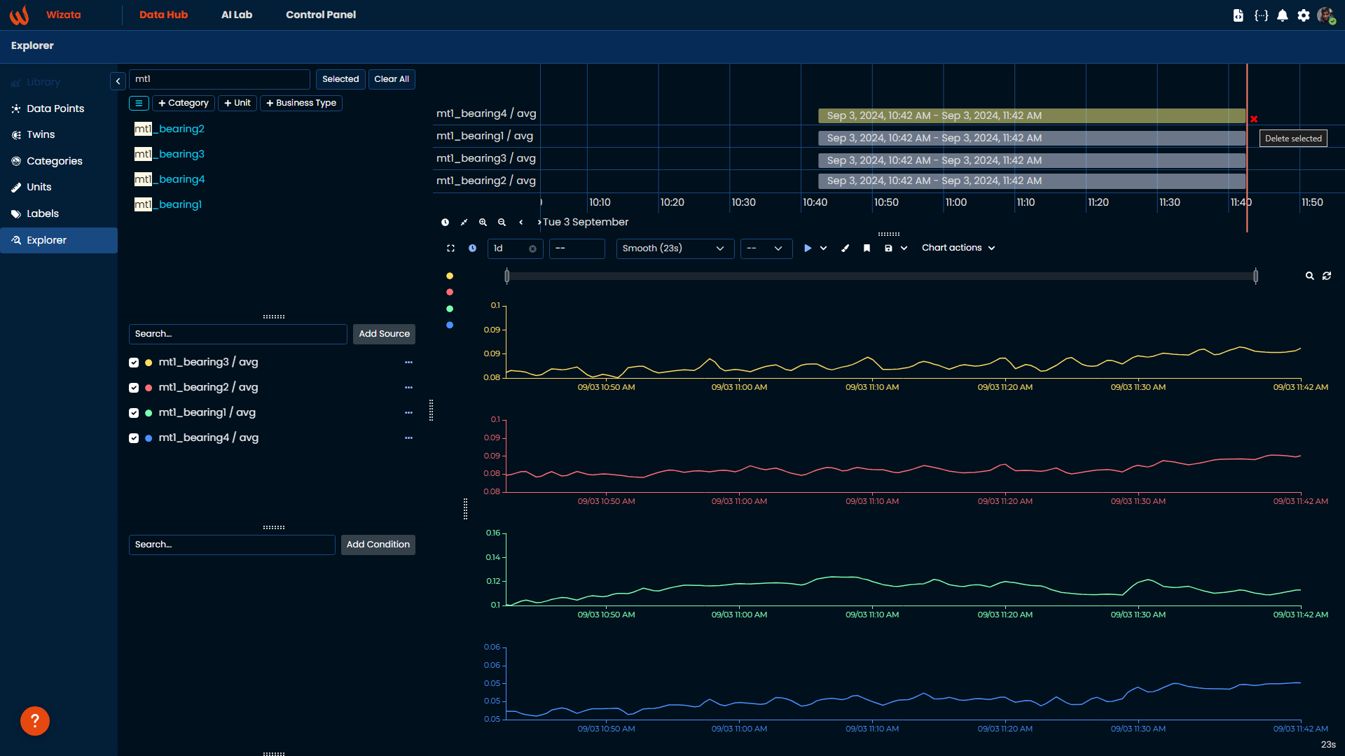
Additionally, a visual interactive interface of the timeline of the selected data points is displayed at the top of the screen. Click on a data point timeline to be able to change the start time, stop time, total interval, or to remove the data point from the selection.
Saving a custom view and export data
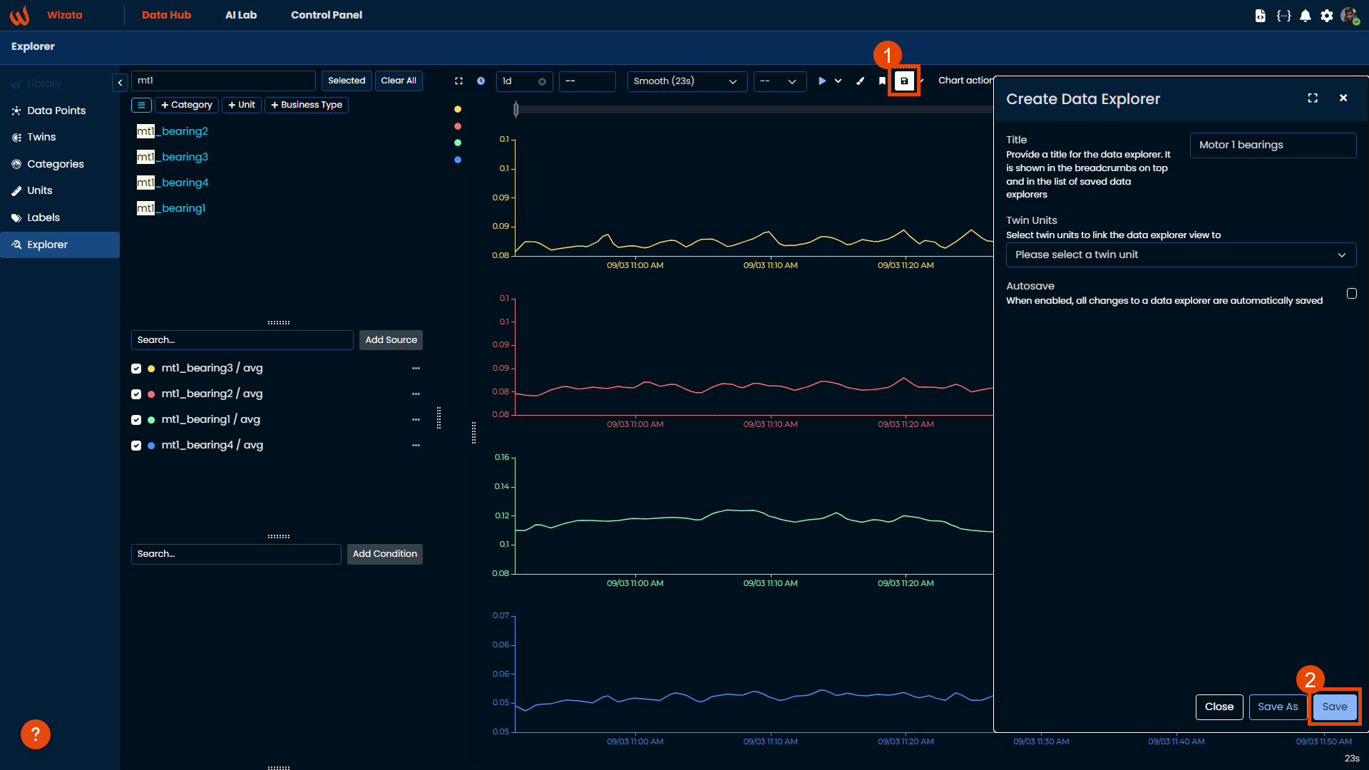
To add at the top-middle part of the Explorer, you will find a floppy disk icon. In this panel you will be able to save your actual data explorer with all the properties and conditions, to reuse it later. You need to provide a title, and you can optionally decide to add a Twin unit to link the data explorer view and choose if you want it to be autosaved every time you make a new change.
Once its saved, you will find all your data explorers on the bookmark icon. This will be useful once you start customizing your different group of datapoints that belongs to the same Twin Unit.
Updated 9 months ago