Navigation
Control Panel layout
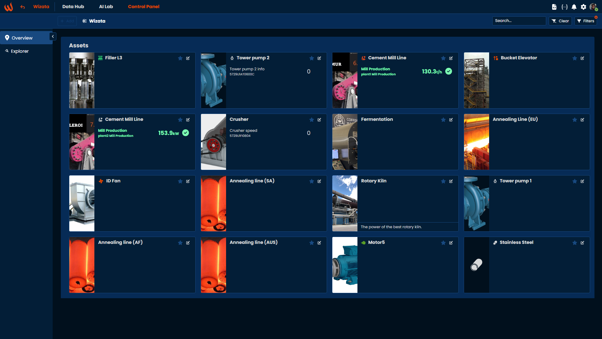
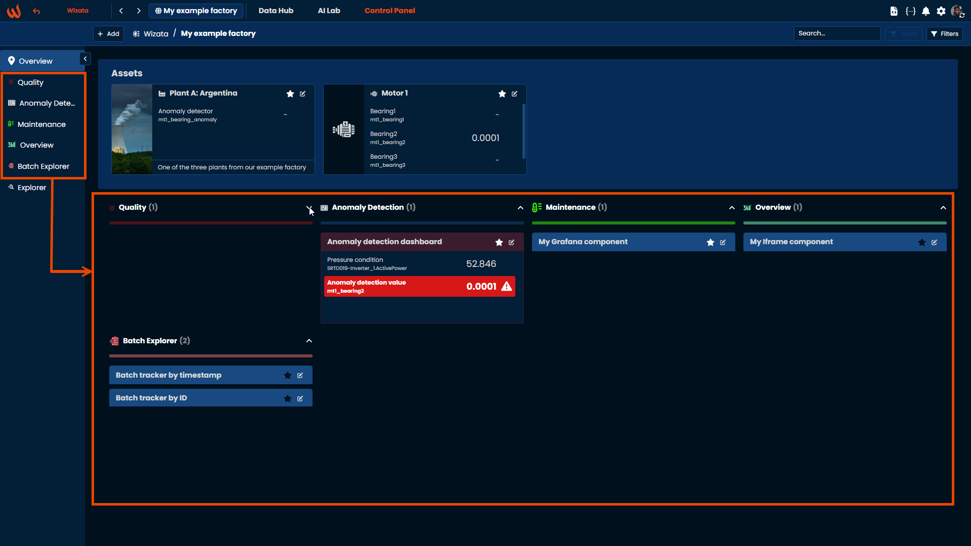
When opening the root page of Control Panel, you get a direct access to all asset having some solutions running in production. The solution are organized based on assets they are attached to. By default, all available solutions are displayed, unless you applied some navigation filters. Each solution can be accessed by a simple click on the corresponding tile in the "Assets" section.
Root page and back button
The Wizata top-left logo (1) serves as a shortcut to quick navigate back to the root page, regardless of the page you are currently situated. Next to it, the back button (2) will take you to the previous page in your browsing history.
Filter assets list
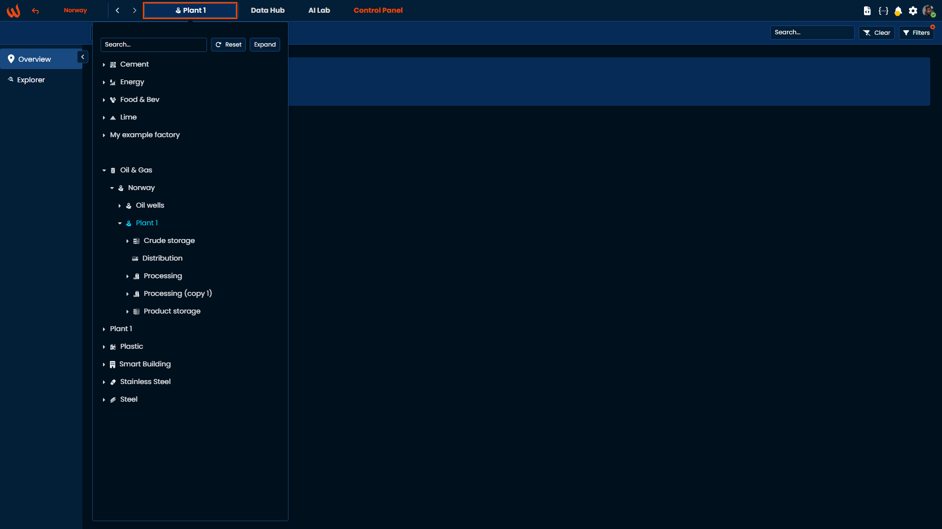
When working in a specific context, it's possible to focus the tiles displayed to only the ones relevant regarding this context. By clicking on the top-left "Wizata" button, the hierarchy of all connected assets is presented in the form of tree, based on the structure defined in the Data Hub.
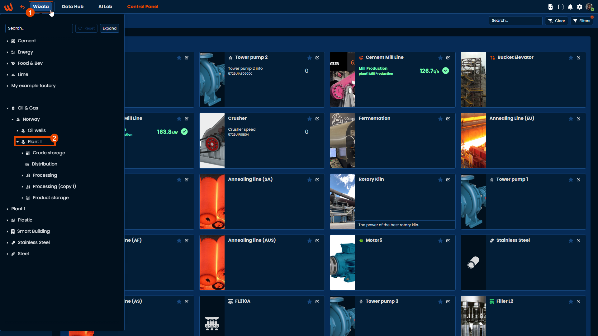
The tree gives the possibility navigate to the plant, line, or asset level relevant to current working context, and clicking on the item will filter the main view with only the solutions belonging to the selected item, or items underneath that level in the hierarchy.
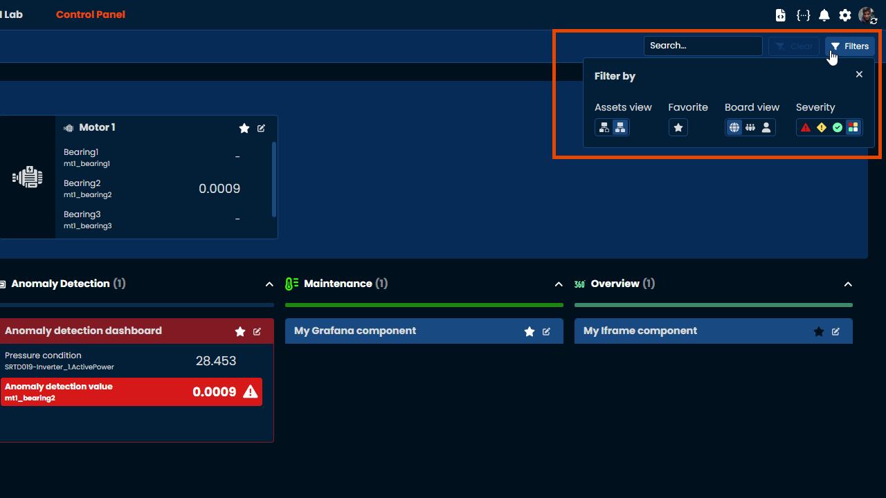
Control Panel filters
Filters are a useful tool for organizing assets and components tiles within the Control Panel. The available options include:
- Assets view: By default, the platform will display all the assets linked to the selected twin + all children/sub-assets. The option on the left will filter only by assets directly linked to currently selected twin.
- Favorite: Filters tiles marked as favorites.
- Board view: Filter components based on their scope --global, organizational, or personal.
- Severity: Displays all tiles containing an insight that matches the selected severity filter.
For more information about Insights, check out our dedicated article here.
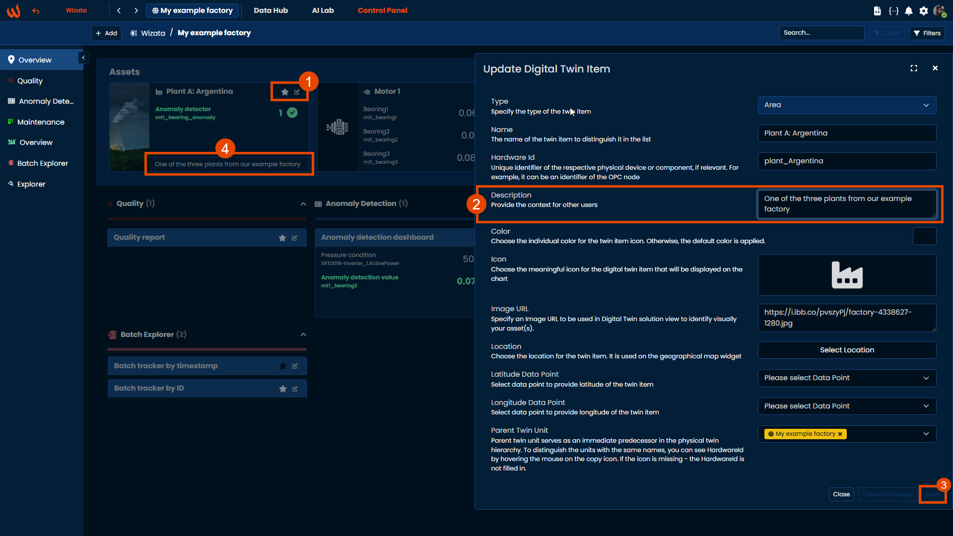
Asset card customization
In addition to attaching Insights, you can customize assets cards by adding images and descriptions.
Each asset displays the image stored in the Twins entity. By default, asset cards show the icon and the color assigned to the twin. To change this, click on the Edit button of the card and add an Image URL to visually identify your asset(s).
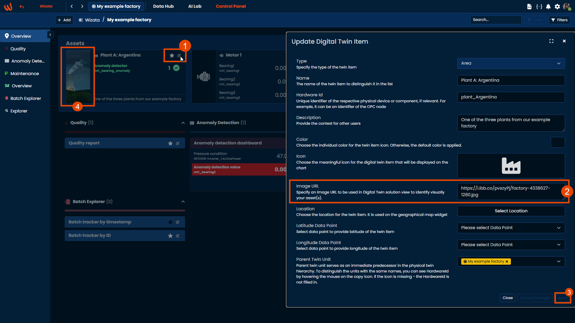
Similarly, you can update the twin description to provide additional context for different tiles.
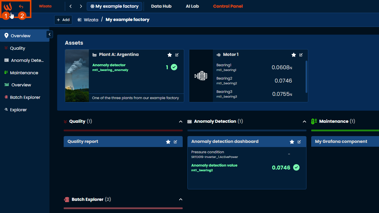
Swipe between assets
After landing on an asset's solution, for example a Grafana dashboard as displayed on next image, a full access to all the solutions attached to the asset are displayed. Once the relevant data has been checked, an easy swipe on left/right arrows switch the view to closest assets in the tree on which some solutions are also deployed.
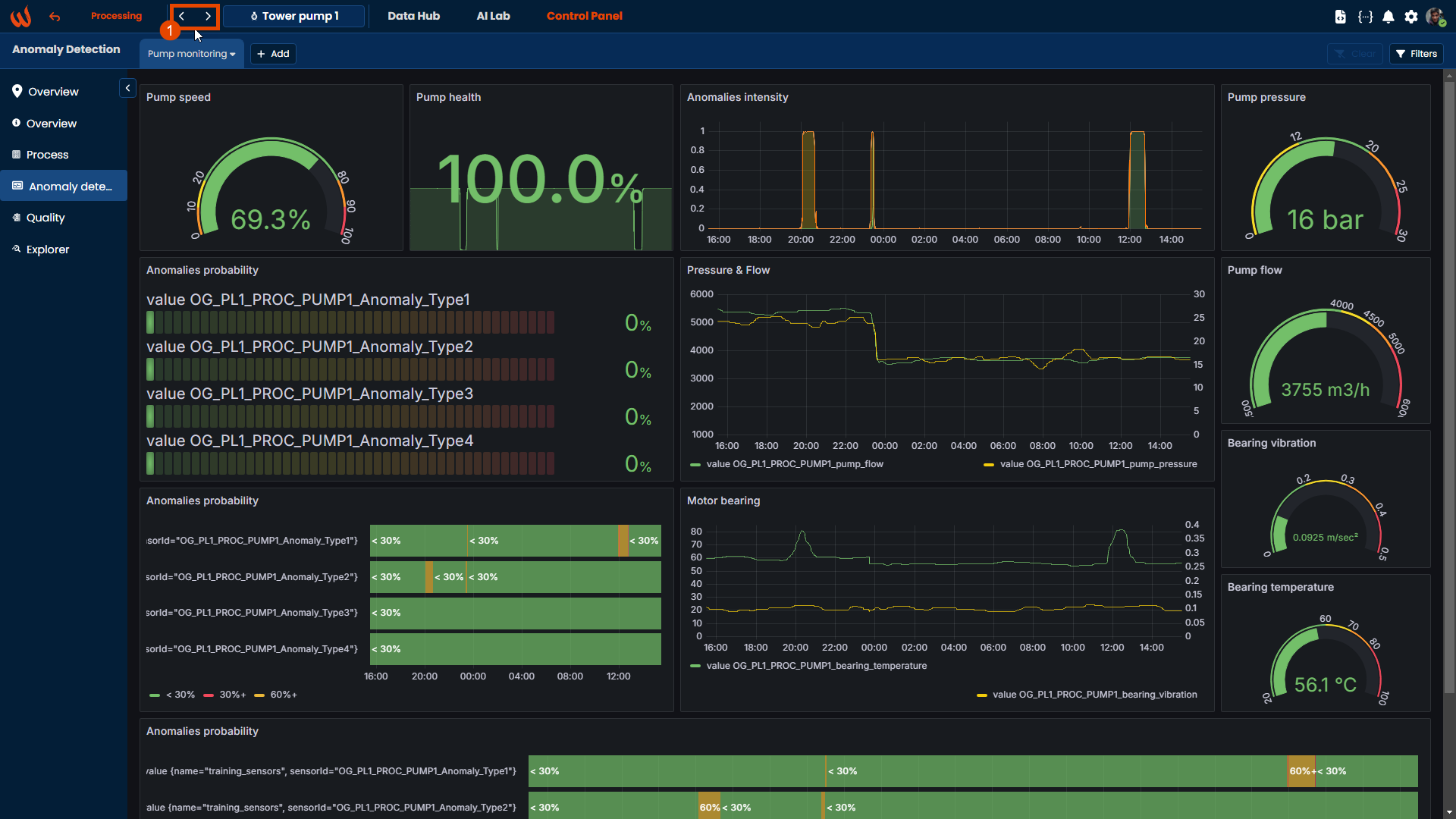
That swipe makes navigation between assets close in the production line easy to reach.
Add Dashboard
If there is not yet any solution on the selected asset, or if an additional solution needs to be added, a simple press on the + button on the dashboards tab allows to quickly create new solution.
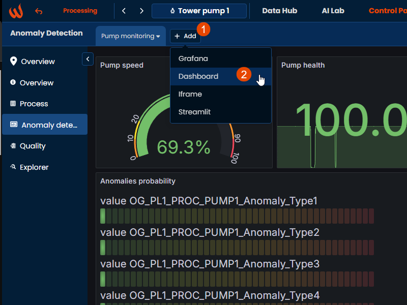
As we explained in the main article, the platform allows to create various types of components solutions such as custom dashboards, Grafana dashboards Iframe content and Streamlit solutions. We will dive deeper into each of these in the following articles.
Business labels utility inside Control Panel
Business labels also work as tags that help categorize and organize various components across the platform.
These are key to simplify the organization of components and to quickly access grouped categories within the Control Panel.
We have a dedicated article to business labels and their usages on Control panel dashboardsYou can fully access to it by clicking here: Managing Business labels
Updated 9 months ago